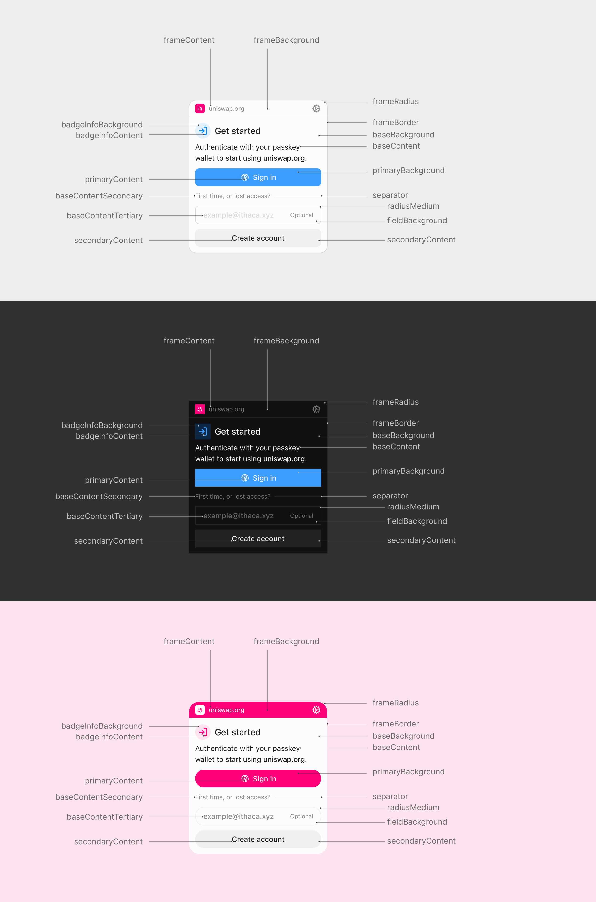
Theming
Porto Themes
Porto allows customize the appearance of the dialog through its theming system. Themes contain various color properties targeting different parts of the dialog, such as the color of the various surfaces, text, buttons and more. See the Theme API to learn more about the available properties and in which context they are used.
Steps
Create the theme definition
A theme definition defines the colors and other styles you want to use in the Porto dialog. The only required property is colorScheme, to let Porto know if you intend to extend the full theme (light dark) or if your theme will only support one color scheme (light or dark).
import type { ThemeFragment } from 'porto/theme'
export const theme: ThemeFragment = {
colorScheme: 'light dark',
primaryBackground: ['#ff007a', '#ffffff'],
primaryContent: ['#ffffff', '#ff007a'],
}Initialize Porto with a theme
Pass your theme to the Porto dialog mode when creating the Porto instance. This applies the theme to all dialog interactions.
import { Mode } from 'porto'
import { createConfig } from 'wagmi'
import { porto } from 'wagmi/connectors'
import { theme } from './custom-theme.js'
const connector = porto({
mode: Mode.dialog({
theme, // pass your theme to Mode.dialog()
}),
})
const wagmiConfig = createConfig({
connectors: [connector],
})Dynamic theme switching
You also have the possibility to switch themes dynamically without reinitializing Porto. This can be useful for implementing a theme switcher or similar functionality in your application.
import { Dialog, Mode, Porto } from 'porto'
import { theme1, theme2 } from './themes.js'
// create a theme controller
const themeController = Dialog.createThemeController()
// initialize Porto with the theme controller
const porto = Porto.create({
mode: Mode.dialog({
themeController,
}),
})
// switch to the first theme
themeController.setTheme(theme1)
// switch to the second theme
themeController.setTheme(theme2)UI Customization
Beyond colors and styling, Porto supports customization of UI elements and text labels through the Mode.dialog() options.
Disabling UI Features
Control which UI elements are shown using the features option:
import { Mode } from 'porto'
const connector = porto({
mode: Mode.dialog({
features: {
// When false, removes the bug report icon from the dialog header
// and disables the report feature on error screens
bugReporting: false, // Default: true
// When false, hides email input field
// Uses truncated wallet address as account label instead
emailInput: false, // Default: true
// When false, hides "Sign up" link in signed-in view
signUpLink: false, // Default: true
// When false, hides "Create account" button and "First time?" label
createAccount: false, // Default: true
},
}),
})bugReporting- Show/hide bug report icon and error reporting UIemailInput- Show/hide email input field (uses wallet address when hidden)signUpLink- Show/hide sign up linkcreateAccount- Show/hide create account button
Customizing Text Labels
Customize button text, prompts, and other labels using the labels option:
import { Mode } from 'porto'
const connector = porto({
mode: Mode.dialog({
labels: {
// Sign-in prompt text
signInPrompt: 'Use passkey to sign in to', // Default: "Use Porto to sign in to"
// Button labels (note: no "Button" suffix)
signIn: 'Sign in with passkey', // Default: "Sign in with Porto"
signUp: 'Sign up with passkey', // Default: "Sign up with Porto"
createAccount: 'Create passkey account', // Default: "Create Porto account"
signInAlt: 'Continue with passkey', // Default: "Continue with Porto"
// Account management links
switchAccount: 'Change account', // Default: "Switch"
signUpLink: 'Set up', // Default: "Sign up"
// Email and support
exampleEmail: 'user@example.com', // Default: "example@ithaca.xyz"
bugReportEmail: 'support@example.com', // Default: "support@ithaca.xyz"
// Frame title (not currently implemented)
dialogTitle: 'Passkey', // Default: "Porto"
},
}),
})Note: Labels are only used when their corresponding UI elements are visible (controlled by features).
Combining Customizations
Combine theme colors, features, and labels for complete control:
import { Mode } from 'porto'
import type { ThemeFragment } from 'porto/theme'
// Define theme colors separately
const theme: ThemeFragment = {
colorScheme: 'light',
primaryBackground: '#007bff',
primaryContent: '#ffffff',
}
const connector = porto({
mode: Mode.dialog({
theme,
// Passkey-only authentication (no email collection)
features: {
emailInput: false,
signUpLink: false,
},
// Custom branding
labels: {
signInPrompt: 'Use your passkey to access',
signIn: 'Access with passkey',
bugReportEmail: 'help@myapp.com',
},
}),
})This creates a streamlined, branded passkey authentication experience.